]]>
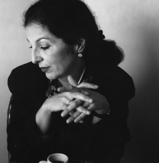 Founded in 1989, Louise Fili Ltd is a graphic design studio specializing in brand development for food packaging and restaurants. Formerly senior designer for Herb Lubalin, Louise Fili was art director of Pantheon Books from 1978 to 1989, where she designed close to 2,000 book jackets. She has received Gold and Silver Medals from the Society of Illustrators and the New York Art Director’s Club, the Premio Grafico from the Bologna Book Fair, and three James Beard award nominations. Fili has taught and lectured extensively, and her work is in the permanent collections of the Library of Congress, the Cooper Hewitt Museum, and the Bibliothèque Nationale. She is co-author, with Steven Heller, of Italian Art Deco, British Modern, Dutch Moderne, Streamline, French Modern, Deco España, German Modern, Design Connoisseur, Typology, Stylepedia, Euro Deco, Scripts, Shadow Type, and Stencil Type. Fili has also written Elegantissima, Grafica della Strada, Graphique de la Rue, The Cognoscenti’s Guide to Florence, and Italianissimo. A member of the Art Directors Hall of Fame, she has received the medal for Lifetime Achievement from the AIGA and the Type Directors Club.
Art 85
Assignment 4
Due December 2nd 2014
The age-old question of which came first, the chicken or the egg. Many can argue one or the other, but there is no correct answer. This concept is similar as well for artists and designers. Do artists copy designers? Do designers copy artists? In this paper, we are going to look at artists and designers’ work that are greatly similar and discuss who influences who. We will also discuss the concept of high and low art. This is debating which type of artistic style is viewed as more creative and valuable.
Before we compare artists and designers, I am going to discuss high and low art. The concept of high and low art could be traced back to the eighteenth century where people compared fine arts with craft. One definition of high and low art is that “high art is appreciated by those with the most cultivated taste. Low art is for the masses, accessible and easily comprehended.” I would consider very realistic paintings like those of Raphael to be very high art. The techniques used to portray realistic scenes takes a lot of skill and time to create such beautiful works of art. In my opinion, high and low art is not an exact science, it is all based on individuals’ preferences and thoughts. Some people might like a piece while others do not. It is all personal opinions. “People who feel strongly that high art is good and low art is bad will think of low art as something to be avoided. Others take a more tolerant position. They hold high art to have higher value, but see low art as “having a place”.”
The two works of art above could be considered very similar. The work on the left is by designer Muriel Cooper and the work on the right is by artist Sonia Delaunay. Both pieces work with simple shapes and lines. Delaunay uses circles and lines to create a spiral shape. Cooper uses different shapes to form a spiral and circular feeling to her work. Delaunay considers her work of art a “mere exercises in color.” She uses “liberating color, movement and form from two dimensions.” Muriel Cooper uses a pop of color in her piece. The purple and slight touch of contrasting yellow forms the illusion of the spiral being three-dimensional.
As we can see by the dates, Sonia Delaunay created her piece much earlier than Muriel Cooper. Some people may say Cooper was inspired by Delaunay and copied some of her ideas. I believe it is possible that Cooper did copy, but I also think it is very much plausible for the works to have nothing to do with each other. In some cases, the art and deign might be exactly alike to where one work was copied by another. However, for this design by Cooper, it might just be a coincidence that they look similar. I believe there is no one creator of this type of spiral effect. Everyone has similar ideas. This is why when we study history; we see similar ideas and inventions by civilizations that never had any contact with one another. We cannot be sure that this is inspired by Delaunay unless the designer confirms so. As I mentioned before, the concept of low and high art is all very opinionated. Being a designer myself, I know what work it took for Cooper to create her piece of work. I would consider this work to be high art. However, many people would think otherwise.
I believe it is very obvious that these two works above are very similar. Designer Jennifer Moria designed the work to the left and the work to the right is by artist Roy Lichtenstein. “Roy Lichtenstein’s paintings based on comic strips are synonymous with Pop Art.” The style of Pop Art includes making tiny dots that when viewed from far away, create the sense of a solid color. Moria was highly influenced by the Pop Art style. She may not have taken inspiration from Roy Lichtenstein himself, but from Pop Artists as a whole. Her use of dots and primary colors are exact replications of Pop Artists’ work. Pop Artists draw their own people, however it looks like Jennifer Moria took a photograph of a person and created the Pop Art dots on top of the photograph. Moria also added her own personal touch with typography and experimented with different tints and shades of primary colors. She also exaggerates her dots as opposed to the tiny dots of Lichtenstein.
It is difficult to determine if these works are high or low art. The purpose of Pop Art was to get rid of the concept itself. “By creating paintings or sculptures of mass culture objects and media stars, the Pop art movement aimed to blur the boundaries between “high” art and “low” culture. The concept that there is no hierarchy of culture and that art may borrow from any source has been one of the most influential characteristics of Pop art.” “The subject matter became far from traditional “high art” themes of morality, mythology, and classic history; rather, Pop artists celebrated commonplace objects and people of everyday life, in this way seeking to elevate popular culture to the level of fine art.” Today, many people would consider Pop Art as fine art, therefore making it high art as well. I believe both pieces are high art. I love the style of Pop Art. I love the vibrancy of primary colors. I think my love for Pop Art is what drew me into Jennifer Moria’s design.
Who influenced whom? Is it stealing? Is it copying? We honestly don’t know the answers. Yes we can calculate which came first based on dates, but we cannot be entirely sure if a person copied another person’s work. We also cannot create a definite answer for high or low art because everyone has different opinions and preferences based upon art and design. However, we can conclude that it does seem that people constantly look at other people’s works to inspire their own.
http://www.aiga.org/medalists/
http://therapidian.org/high-and-low-art
http://www.artnet.com/magazineus/reviews/nathan/sonia-delaunay-cooper-hewitt3-24-11.asp
http://www.metmuseum.org/collection/the-collection-online/search/482133
http://www.theartstory.org/movement-pop-art.htm
]]>
Select a current artist and designer and relate the process and design format for each. Compare and contrast the process and style to each other please use distinct historical references. Since this class is based on visual references particular attention is paid to composition and format. Students are asked to review and select these artists and designers from a modern style – 1930s to 1980s and from a post modernist style – 1980s to present. A supplemental reading is prescribed, typically one that deals with the concepts of “high” and “low” art. The student is asked to identify each selected work as “high” or “low” art and to contrast and compare the work as it pertains to its communicative ability within its historical context and its reach and interaction towards a combination of art or design. Students are then asked to critique the work from the prescribed design vocabulary and to write to that fact within their papers. A formal presentation is done to expose the class to a wider range of artists and designers.
Paper 4 Outline
Artists and Designers
This assignment is focused on showing the similarities and differences between a specific artist and a designer. In some cases the two worked at the same time and in other cases they were offset by decades.
The images will be discussed as they pertain to the Elements, Principles and Components of Design and how successfully they used these to communicate the concept and substance of the work.
- David Carson – Dada Typography
- Comic Book – Roy Lichtenstein
- Stefan Sagmeister – Andy Goldsworthy
- Paula Scher – Paula Scher
- Milton Glaser – early Picasso
- Alexey Brodovitch – Robert Motherwell
- Dan Wieden – Andy Warhol
- April Greiman – Heartsfeld
- Aaron Draplin – Coats of Arms
- Chuck Anderson – Larry Poons (early work)
- Chip Kidd – Fernand Leger
- Supreme branding – Barbara Kruger
- Erik Marinovich – Toulouse Lautrec
- Violaine & Jeremy – Albrecht Durer
- Louise Fili – Gustav Klimt
Elements
Line –
Shape –
Space – Illusion, Implied, Actual and Pictorial
Texture/Tone –
Color –
Principles
Balance – Symmetrical/Asymmetrical
Rhythm –
Unity/Variety –
Proportion/Scale –
Emphasis –
Components
Dominant –
Subdominant –
Focal Point –
Motion –
Counter Motion –
Henri Émile Benoît Matisse was a French artist, known for both his use of colour and his fluid and original draughtsmanship. He was a draughtsman, printmaker, and sculptor, but is known primarily as a painter.[1] Matisse is commonly regarded, along with Pablo Picasso, as one of the artists who best helped to define the revolutionary developments in the visual arts throughout the opening decades of the twentieth century, responsible for significant developments in painting and sculpture.


Analyze Matisse’s work via Elements, Principles and Components of Design.
| Element | Usage |
| Line | minimal line is used – primarily full shapes |
| Shape | shape is the primary element used to define the image/message |
| Space – Illusion, Implied, Actual and Pictorial – | Pictorial space is used primarily as that the image fills the plane and only minimally goes off of the plane |
| Texture/Tone | the tone is flat with no sense of volume or gradation |
| Color | mostly monochromatic or analogous only using contrast to access the focal points |
| Principles | Usage |
| Balance – Symmetrical/Asymmetrical | Mainly asymmetrical balance |
| Rhythm | Confined tight – used mainly with green squares |
| Unity/Variety | Very unified – variety used for emphasis – gathering into one shape |
| Proportion or Scale | Mainly in proportion but scale used to emphasize dominance |
| Emphasis | Color and shape changed used to create focal point |
| Components | Usage |
| Dominant – | Used via body shapes and common color |
| Subdominant – | Smaller star-like shapes and different body parts |
| Focal Point – | Red shape in center of body |
| Motion – | Mainly circular moving towards viewer |
| Counter Motion – | Large red bar behind flower-like object |
Paul Rand (born Peretz Rosenbaum; August 15, 1914 – November 26, 1996) was an American art director and graphic designer, best known for his corporate logo designs, including the logos for IBM, UPS, Enron, Morningstar, Inc., Westinghouse, ABC, and NeXT. He was one of the first American commercial artists to embrace and practice the Swiss Style of graphic design.
Rand was a professor emeritus of graphic design at Yale University in New Haven, Connecticut where he taught from 1956 to 1969, and from 1974 to 1985. He was inducted into the New York Art Directors Club Hall of Fame in 1972.

Analyze Rand’s work via Elements, Principles and Components of Design.
| Element | Usage |
| Line | minimal line is used – primarily full shapes |
| Shape | shape is the primary element used to define the image/message |
| Space – Illusion, Implied, Actual and Pictorial – | Pictorial space is used primarily as that the image fills the plane but in some go off of the plane for emphasis |
| Texture/Tone | the tone is flat with no sense of volume or gradation |
| Color | mostly monochromatic or analogous only using contrast to access the focal points – also using tone to establish unity in background elements |
| Principles | Usage |
| Balance – Symmetrical/Asymmetrical | Mainly asymmetrical balance |
| Rhythm | Starts to move randomly – used mainly with purple squares |
| Unity/Variety | Very unified – variety used for emphasis – supporting main complimentary shape |
| Proportion or Scale | Mainly in proportion but scale is used to emphasize dominance and to create rhythm |
| Emphasis | Color and shape changed used to create focal point |
| Components | Usage |
| Dominant – | Used via body shapes and common color |
| Subdominant – | Smaller star-like shapes and different body parts |
| Focal Point – | Red shape in center of body |
| Motion – | Mainly circular moving towards viewer |
| Counter Motion – | Large red bar behind flower-like object |
Conclusion
Write 200 words on the similarities and differences of both the artist and the designer.
Who “wore it best”?
Which was a better use of the style and format?
Did the use of style and format successfully communicate the message(s)?
Could the artist or designer have used a different style or format to communicate the message?
Bibliography
Due Date: 12/4/20
http://www.artinamericamagazine.com/reviews/overview-between-the-high-and-the-low/

Great Article found by Erik Solares
– https://www.therapidian.org/high-and-low-art
Also Ziggy Stardust for Ponds?


watch –
]]>